Here you go
1 Like
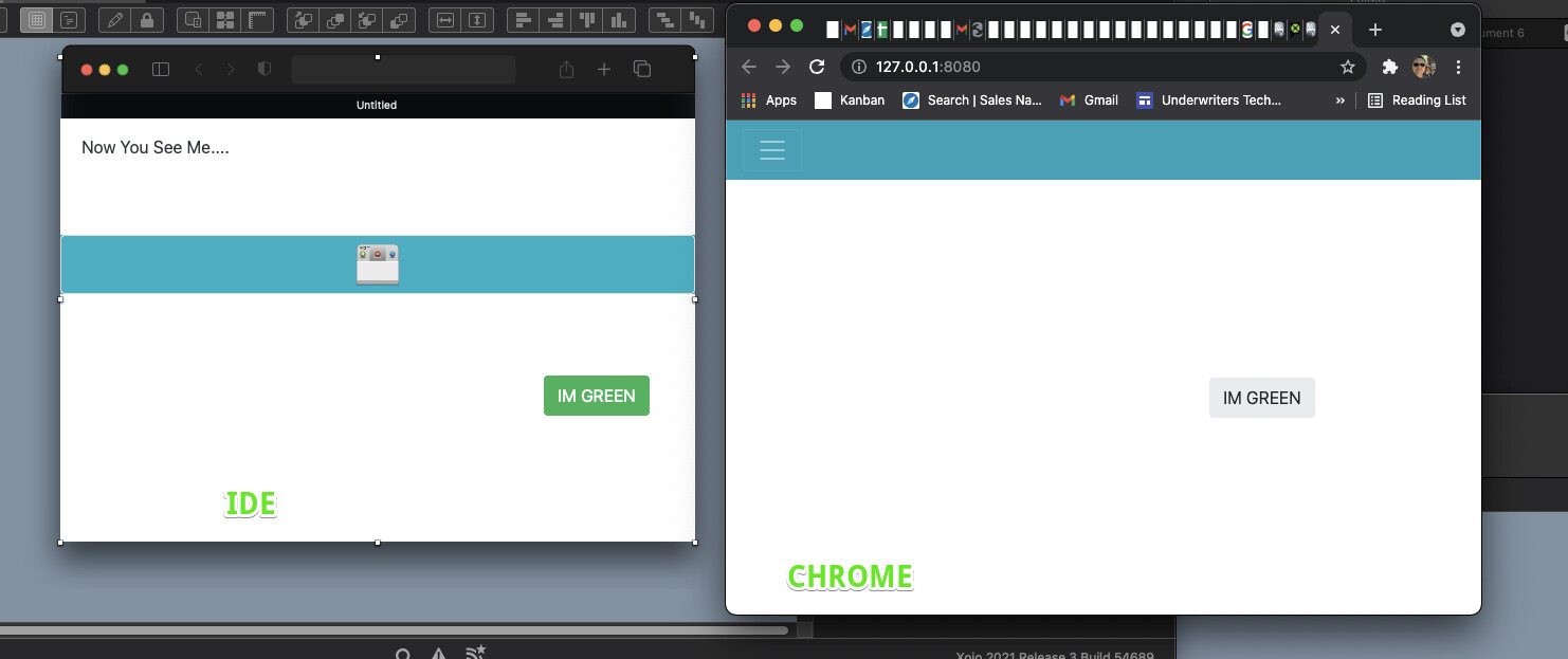
1.00 and 2.00 have very different goals.
1.00 was meant to look and feel very much like desktop. In order to do so, dimensions and placement of controls were very tightly controlled.
2.00 is meant to feel like the most modern web sites, where controls place are dependent on the size of the browser. Greg could probably chime in to describe it more, but essentially, the goal of Web 2.00 is no longer to look and feel like desktop.
If you absolutely need WYSIWYG, use Web 1.00.
1 Like
I hate to break it to you but web 1 was not wysiwyg either.
If the user expects to be able to drag it around on the screen and have all of the rest of the niceties of the layout editor, then yes, it absolutely is slower.
¯_(ツ)_/¯
I know, you’re good developers. But if you look at Software like Hype for instance, which uses a browser control, then it’s hard to believe, that there’s no way to do a fully wysiwyg editor for web.
Anyway, WYSIWYG is overrated in my opinion. It is nice for layouting things, but it will never show the real state of an application or website when it is used. It only shows an “initial” state which often different than the real “use state”.
1 Like
Indeed, especially when Web is concerned.
1 Like
And if we were building an app from scratch that only needed this, we’d probably do it that way too, but we are not in that situation.
Greg, Out.
And I completely understand that!
My only point was, that it is hard to believe that modern browser couldn’t handle that, while there are several examples which are proving that.
1 Like