I’m just a hobby programmer, so there’s no real need to produce a fancy looking app. Still, since starting to write Mac apps for my own use in Xojo I am missing vibrancy very much as an aesthetic feature – and even Xojo itself is using it by now.
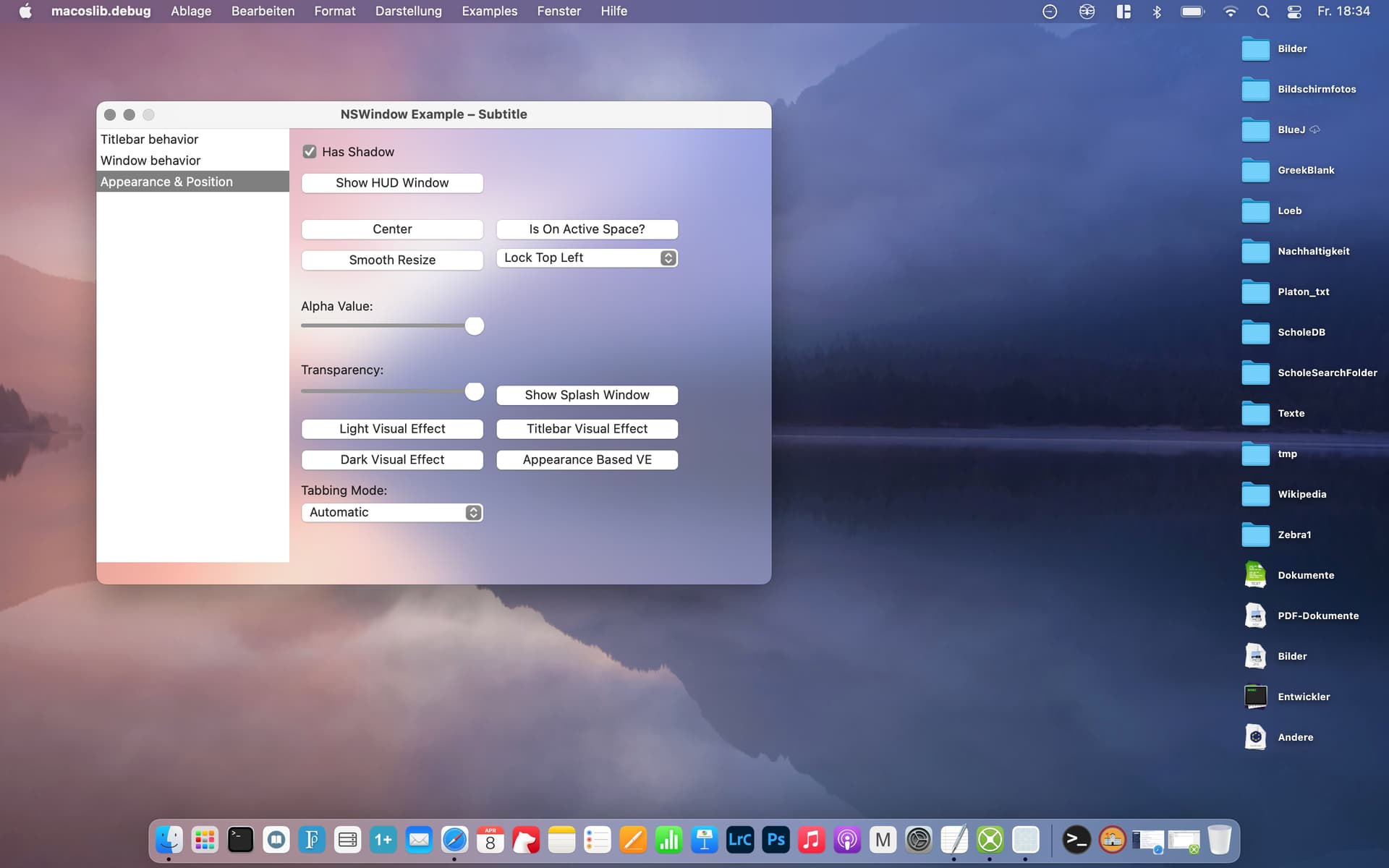
Without knowing much about declares, I just downloaded macoslib and created an instance of the NSWindow example. There are (too) many properties and methods to wrap my head around, and the window’s behaviour is quite strange – the (too strong) vibrancy effect (see picture) only appears after having opened the splash screen once, which complicates understanding and using macoslib even more.
So the question remains: Isn’t there an easy way to implement this effect? (And I’m wondering why Xojo itself doesn’t offer the effect as the IDE uses it and is supposedly written in Xojo itself.)
(And sorry for my language – I’m not a native speaker and unable to put my current frustration in proper words …)
Last time I looked at macoslib is was barely useful. Not sure if it is any better now.
Still, the only way to do it right is with the MBS plugins or Appkit. Don’t think there is an alternative that will work good.
Of course you can wait for Xojo Inc implement it in the future.
There’s no guarantee what it will mean, nor when it will be delivered. However, I think there are some obvious things a modern Xojo Mac app should support, and vibrancy is one of them. I’m sure the MVPs will be advocating for the things that we need in our Mac apps. Anyway, I was just pointing it out on the roadmap.
@Sam_Rowlands tool App Kit has a lot of macOS only elements like vibrancy. They are complicated topics though (declares, xojo views, mac views, all the tech that goes into it I mean). To my knowledge, I’m not sure I’d say any way to implement the effect in Xojo is “easy”.
@TimStreater : have a look at the screenshot from OP. I call it visually distracting and the most superfluous feature of macOS. Apple says:
macOS apps use translucency and blurring to evoke a sense of depth, by enabling views and controls to hint at content residing in the background. They also use vibrancy, a subtle effect that dynamically blends the foreground and background colors using a careful balance of lightening and darkening techniques. This combination helps make foreground content stand out against any background.
Well now a know little about why/how Outlook’s navigation pane sometimes gets color-ey and translucent. But I still have no idea what it’s trying to tell me or what triggers it, which I guess says something about its intuitiveness and informative-ness.
Also Titlebars, popovers, Menus, HUD Windows, listbox headers, heck even the window background now uses Vibrancy.
@JensK Vibrancy is one of those things that if you want it done correctly, you’re going to have to put in the work (and currently money). Yes there’s some free declares floating around, but they’re incomplete.
@Martin_T: I just played a bit with the code in the linked post, and for now it seems like a nice workaround for my purposes. (See picture – contrasty desktop background for better visibility of the vibrancy effect, which can be regulated by alpha value of the fill color in the paint event.)
Those are two canvases, one for the left side bar (with another color) and one for the top/bottom of the main field (with less transparency). That was just for testing purposes, because the correct resizing of the canvases was a problem at first, until I found out how to regulate the resizing behaviour.