First of all I’m not throwing rocks here. I’m trying to figure out the most efficient way to work around the problem. Last time I posted something about the IDE / WYSIWYG it turned into an ugly mess here on the form. Let’s avoid that.
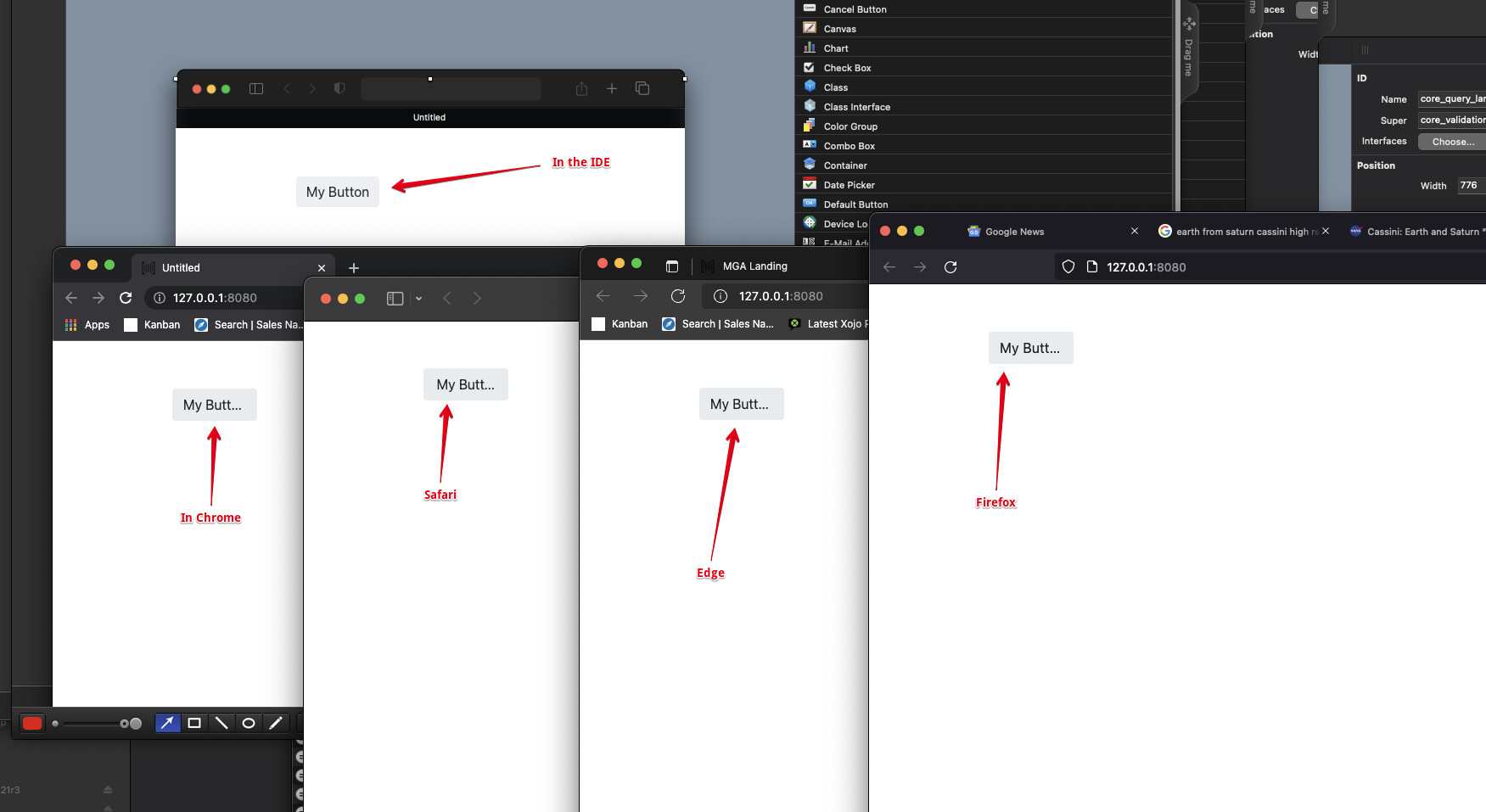
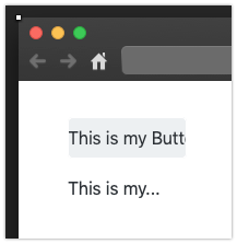
Having said that, I’ve encountered a problem with the IDE that makes development slower. I have drag button out when I have not altered its style in any way. I have not changed shape or default size nor have I applied any sort of font to it. But unfortunately the IDE does not render the button the same as a browser. It seems any browser.
Short of “just make a fat buttons” can someone kindly give me some sort of understanding behind the code that truncates the sting and add three dots? Is it a percentage? What I’m trying to do is understand when I need to be careful, and I would like to not have to go to the browser every time I had a control that needs to be checked.
As was mentioned before, the IDE employs an engine which is similar to what a browser would do at runtime, but it’s not exact. Browsers use CSS to figure out how everything on a page will look, including their positions, size, margins (space outside the border), padding (space inside the border), text size, etc. One major issue that we have is that in many places, the IDE’s drawing system doesn’t employ the same units systems that CSS does. For instance, font size in bootstrap is often expressed in Ems. Em height is relative to the line height of the current font, in a particular place in the current web document. The Xojo framework also doesn’t have a mechanism to deal with kerning. We also don’t know when drawing in the IDE, what font will actually be used at runtime and each font has its own set of metrics.
So we have to guess.
Now depending on your experience, you may or may not think that the IDE does a good job guessing. Because of the guessing going on, anything with text is going to be a little off, but again, it’s not meant to be wysiwyg. It’s meant to be a close approximation.