In those last and worst times when Xojo clearly is struggling then I would like to point out 5 minute fix that they could do that would improve things quite a bit even if not making it “great” then its still far better than how it is now.
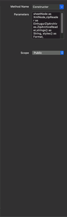
In the method editor, we all know how impossible it is, but if looking for quick improvements, then if they were to move the labels above the editors, Method name above the combo box, Parameters above the Text box. (and Scope above the combobox to be consistent) then you have roughly 2x wider space in this spot where its almost impossible to edit or see anything.
And for classes inspector we miss a quick overview of the implemented class interfaces. This could be for example a listbox (showing the implemented class interfaces).
It would be nice if all the space was used and to be kept small at the same time (overall).
Good idea. But nothing is a 5 minute fix. Don’t be such a gloom-and-doom person.
The idea is a good one. But the area is a very complex one. The order of the fields never really stayed the same. I still get <https://xojo.com/issue/57894> which is like a slap in the face every time I edit a control.
maybe it could be responsive design if this area get smaller than first label and below the input.
but better readable is it if the label appear as column like the window inspector currently show.
the method parameter input is somehow unhandy.
sometimes i written it in code editor and then i use cut/paste.
Thanks for bringing this up. I’ve always thought exactly the same thing, but was too lazy to make a feature request. The way it’s currently set up, there’s a lot of wasted space.
Yeah i know but i want simpler access, interfaces are used alot in ios and are more and more common . Having bigger and bigger projects faster oversight would be really helpful.
The horizontal label/value layout isn’t that bad if you have a larger screen. Having recently upgraded to a new iMac from a 13" MacBookPro, I’m really enjoying the extra screen real estate.
The problem with a vertical layout means that all of the single line entries cost 2 lines and make you scroll even further down to find what you need.
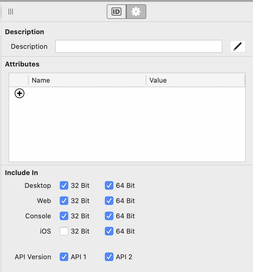
For the Parameters, I’d like to suggest they be presented like the Attributes.
Fair point, your proposal is definitely “cleaner”.
On the other hand most of us are using methods all the time. It is faster to write your code into a text area, rather than having to click to add new values.
On top of that the OP talked about a 5 minute fix, and @Björn_Eiríksson is right here: it can’t be a lot of work to only rearrange the UI components in the IDE and to give us all more real estate on our screens ;-).
Admittedly, the current interface could use some help.
If it was designed to do so, you could simply tab from field to field… and then return to create the next row… instead of clicking the + button each time. I’d prefer to simply press tab rather than having to type " As " and ", " each time.
Agreed, but you have as well “extends” another stuff without “values” … that was probably what I had in mind. But for sure there is much room for improvement, but all of this is beyond the “5 minute tweak” Björn originally suggested ;-).
There are low-hanging fruits giving immediate benefits to users without needing to wait for a long-term IDE interface remodelling needing a LOT of resources.
I really hope Xojo will take some of the suggestions and make these incremental changes when possible.