Some Fonts Clipped In Labels

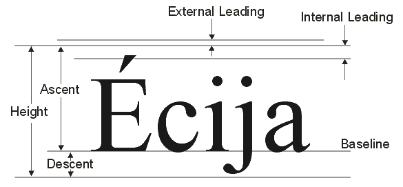
We want to use some custom fonts in our app, and really like the Open Sans face from Google Fonts. However, this font appears to either have a different “leading” (the space between lines) or some other funkiness in the glyphs that force the baseline of the font to be much lower than the baseline of other fonts when it is put into a label. Here is an example of Arial on a label:

Here is the exact same label with Open Sans instead - nothing else changed:

In looking through some of the other fonts on my computer, I notice that this is not unique to Open Sans - but rather is prevalent among lots of fonts, to varying degrees:
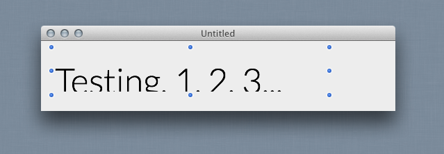


Now these are not off-the-wall-oddball fonts, either… some of them are apple system standard fonts. Some work fine, some don’t. Some are only shifted a little, others are shifted nearly completely off the label so you can only see the tops of the letters. This also seems to be agnostic of the font size as well - so these examples are at 50px size, but it is just as noticeable at 20px and 200px. Also, this happens in labels and text fields, but not in other UI types, like the headers and contents of listboxes, etc.

Further, I’ve checked, and it does not seem to have anything to do with the format of the font files (some are .otf, some are .ttf, etc) or whether the font has a large family or only 1 variant.

So, here’s my question: Can I do anything about this other than make the label taller? Some of my UI space is already very crowded, and I will wind up with overlapped controls etc if I am forced to make my labels 30-40% taller to make sure the fonts show up.

Also note, I have not tested this cross platform yet - only on my Mac, running 10.8.3, in 2013R23, Cocoa builds.

Any insight would be welcome.

Thanks!

Bump.

As I recall, the baseline location is defined in the font itself. It might be worth drawing the label yourself using a canvas control.

Hmm… I think I’ll just use a font that is close to Open Sans but has a sane baseline for now. Switching every single label in the entire app (we’re talking thousands here) would be more work than its worth to use that specific font.

I was just hoping there would be a simple way to subclass Label and adjust the baseline, but it appears that is not possible.

You can calculate the metrics of the font and string you want to display, then resize the control appropriately. This adjusts the height of a Label:

[code]Sub AdjustHeight(extends st as Label)
dim p as picture
dim g as graphics
dim lines() as String
dim i, maxWidth as Integer
dim h as Integer

p = new picture(10, 10)
g = p.graphics
g.textFont = st.textFont
g.textSize = st.textSize
g.TextUnit = st.TextUnit
g.bold = st.bold
g.italic = st.italic
g.underline = st.underline

h = g.StringHeight(st.text, st.width)

while (h mod g.TextHeight) <> 0
h = h + 1
wend

if st.Height <> h then
st.Height = h
end if
End Sub
[/code]

And this adjusts the width of a label:

[code]Sub AdjustWidth(extends st as Label)
dim p as picture
dim g as graphics
dim gs as GraphicsState
dim lines() as String
dim i, maxWidth as Integer

p = new picture(10, 10)
g = p.graphics

g.textFont = st.textFont
g.textSize = st.textSize
g.bold = st.bold
g.italic = st.italic
g.underline = st.underline

maxWidth = 0
lines = st.Text.Split(EndOfLine)
for i = 0 to UBound(lines)
maxWidth = max(maxWidth, g.StringWidth(lines(i)))
next
st.Width = maxWidth + padding
End Sub
[/code]

A method in the same spirit as Brad’s could do the opposite and find what’s the largest size the current text would need to be to not be larger nor taller than the label, which might be a better option when layout is fixed. The process is the same but you have to go through multiple sizes until you go overboard on either side and then notch it back one size.

The function below would probably work better by spitting out the optimum font size, but it’s what I had on hand :smiley:

[code]Function FindFontSize(g As Graphics, Text As String, Width As Integer = -1, Height As Integer = -1) As boolean
If (Width = -1) Then Width = g.Width
If (Height = -1) Then Height = g.Height

g.TextSize = Min(Width, Height)
Dim StringWidth As Integer = g.StringWidth(Text)
Dim StringHeight As Integer = g.TextHeight

Do Until (g.StringWidth(Text) <= Width) And (g.TextAscent <= Height)
g.TextSize = g.TextSize - 1

StringWidth = g.StringWidth(Text)
StringHeight = g.TextHeight

If (g.TextSize = 0) Then Return true

Loop

return true
End Function
[/code]

As mentioned elsewhere the “size” of a font is a tricky thing. The “trick” is in where the string is drawn, as the “baseline” is neither the top nor bottom of the text.

It’s easy to find the Y where the string should be drawn. It’s a bit harder if you want this text to be centered vertically since the letters used themselves shift the “center of gravity” for a string.

[quote=38346:@Eduardo Gutierrez de Oliveira]The function below would probably work better by spitting out the optimum font size, but it’s what I had on hand :smiley:
[/quote]

I’ve got a function like Eduardo’s too, except it uses binary search to fit a font in the allotted width or height. Also, you could make a blank picture, fill it with a solid background color, draw the font in black, then scan rows from top to determine the leading height. Should be a pretty quick operation for run of the mill window Labels. Then adjust their position and height to compensate.

It’s even more fun when you have fonts that have glyphs that draw outside those metrics
Some of the highly ornate script style fonts do this

[quote=38376:@Norman Palardy]It’s even more fun when you have fonts that have glyphs that draw outside those metrics
Some of the highly ornate script style fonts do this[/quote]

Oh, Zapfino, how we love thee :smiley:

This “black-on-black” is a great idea, as it allows you to draw the actual label and figure out the “true” middle height for vertical centering. MMM centers differently and yyy or iii.

Thanks @Brad Hutchings and @Eduardo Gutierrez de Oliveira - those solutions may be worth exploring.