Sometimes is hard to explain things. Sometimes the information is misinterpreted and cases closed.
What the problem is:
the small icon on the navigator for single images is not using the png transparency
What was understood:
the white in the icon should change to dark in dark mode
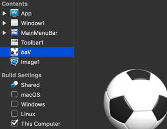
Here is the image on how it looks by default:
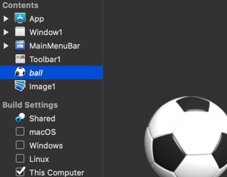
Here is the image as how it is expected to look:
I understand that it was coded this way, but you can see the App and Image1 icon without a solid background making the icon a complete square. I guess that is what Tim wants for the icon, to use transparent background.
[quote=Norman]suppose albertos png is supposed to be transparent where its white
in dark mode that icon is not visible in the navigator[/quote]
No, it only suppose to be transparent around the ball and not all the white parts of it, look at the ball image to the right.
[quote=420636:@Dave S]does the image have a “mask”?
or did it use “transparent=1”[/quote]
That image very obviously has a mask. And these days, no image should ever use the Transparent property. It was a workaround in the classic days before we had alpha channels, but our options are SO much better these days. The only images that look good with Transparent=1 are ones specifically crafted to use it, typically 16-bit pixel art.
As for the original case, I see the point Norman is [poorly] making. Say the icon is black. Maybe it’s a black triangle used in as a mask for a play button. In dark mode without the background, that image will barely be visible. That’s a fair point.
However, the problem is just as likely to be represented with the current technique. If that same triangle is white instead of black, then it’ll never be visible no matter the color scheme used.
I think the background should be the white and grey checkerboard pattern typically used to represent transparency.
Thank you Thom, I guess that’s what Norman is trying to say. At first I understand that he is saying that if all white parts from the ball icon change to transparent (it shouldn’t) then we will not be able to see the ball icon in dark mode. And just wanted to be clear that the case was about the white background showing instead of transparent and not all white parts of the ball icon.
If it has a mask, then it shouldn’t be showing a “background” [I wasn’t advocating for the transparent flag)
I would contend that the mask is not correct, it basically should be “0x000000” [black] where the ball is (ie. opaque), and “0xFFFFFF” where the ball isn’t (ie. transparent). You might have some “gray” around the edges if there was a “soft” edge or shadow
have you attempted to decompose the image into the mask and image layers to see if the mask layer is “correct”?
[quote=420646:@Dave S]If it has a mask, then it shouldn’t be showing a “background” [I wasn’t advocating for the transparent flag)
I would contend that the mask is not correct, it basically should be “0x000000” [black] where the ball is (ie. opaque), and “0xFFFFFF” where the ball isn’t (ie. transparent). You might have some “gray” around the edges if there was a “soft” edge or shadow
have you attempted to decompose the image into the mask and image layers to see if the mask layer is “correct”?[/quote]
Dave I think you’re missing what’s happening here. Look at the ball on the right of the screen, the actual preview. That’s what it should look like. It has the soft edges thanks to the mask. Everything is exactly as it should be.
The second navigator preview is a quick-and-dirty approximation of what it should look like, produced by simply deleting the contiguous white pixels. Somebody could have put more effort into it to swap in the actual PNG for the purpose of the demo, but that level of quality wasn’t necessary here.
Just to be clear, there is no background on the image itself (ball on the right), there is a white background, a black border and a small arrow on the small icon at the left of ball. The second image I manually deleted the background/border (it is not perfect, just to show the idea I have).
Edit: exactly what Thom said, I didn’t put enough effort
Ok… confused… the only difference I see is in the “small” icon. not the large ball to the right.
Is the “arrow” part of the icon? or part of a listbox?
I create masked icons all the time, and have never had a visual issue (including in Darkmode). The Iconbutton class that I posted about elsewhere uses icons made this way and they look fine in both modes
The issue (as I understand it) is that the icon is getting a white background in the navigator. The shrunken icon should be an accurate representation of the image. Adding a white background is technically destructive.
Dave, the feedback case is a missing component here. It makes more sense if you can read the feedback case.
(I know you’re not able to use feedback)
What Tim said. Xojo is adding a white background, black border and small overlay arrow at the lower left of the icon in the navigator.
Personally I don’t think is a big deal. Newer versions of Xojo using Hi-DPI will create an image or image set and not an icon of the image. That’s why I don’t think this is going to be changed.
Here you can see in more detail the white background, black border and small arrow added to an image (Eight Queens Example included with Xojo):
The Star is a png with transparent background.
Albert and I are taking about the unexpected white box surrounding the proxy image that the IDE displays in the Navigator. All of my non-HiDPI images are PNGs with alpha masks and they display correctly in older IDE versions.
I understand Norman’s position, but it just looks hokey.