There seems no obvious way to change the colour or strength of a Group Box border in the Xojo IDE. (fair enough).
I accept that, because the group box control is part of the underlying OS native controls. But what if I want to do it? can I use Declares?
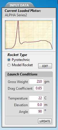
Here is the example of what I’m talking about:
What I don’t like is that with the two group controls (Rocket Type and Launch Conditions) the border is too light IMO.
If you look at the Launch Conditions group, about half way down you will see a standard Xojo separator between Drag Coefficient and Temperature. The separator looks darker than the group control border. I DON’T LIKE IT AT ALL!!!.
In my view, it should be the other way around, ie. Darker Group Box and lighter separator.
I’ll live with it if I have to, but wondering if using windows declares may solve this?
If it CAN be done, then I’ll look into it. I don’t mean if it can be done using a canvas and drawing my own controls into it. I’m sure I could do that. I just want simplicity.
I’m using Xojo2016R3 with Windows 7.
[EDIT] The above image shows the controls layered over a placard.
For the rest, the properties have to be set at creation time.
So the answer would be youd either have to declare your own StaticControl or take Daves advice and create a custom painted Canvas.
I thought you were going to say “Only if you paint yourself into a corner”
I’ve implemented a canvas as suggested by Dave. I did always know about this option, but I was hoping for a simple solution. The reality is that my little “hissy fit” about the border strength pales into insignificance compared to some of the other “real” issues I’ve faced.
I would not have bothered about the strength of the border and just lived with it, except for the fact that there were too many issues with inserting controls within a group box layered over a placard (2016R3 WIN7). Un-natural and insane things. If anyone wants to know, then I’ll explain with the assistance of my current Psychologist.
Regardless, this is what I’ve come up with using a canvas. Being FORCED to use a canvas, I was able to re-evaluate things and make it look clearer (I think):
I’ve retained the standard group box for the “Rocket Type” (makes sense), and re-designed the “Launch Conditions” Panel. This is much much better anyway.
One thing I may as well ask, is when you look at the Launch Conditions panel, at the bottom right corner there’s a button that says “UPDATE”. What do you think this means in relation to the whole panel?
Just a note (because I got burning eyes caused of that):
Temperature must be “°C” and not “C”.
The weight is “metric weight unit” ( I had to search for it). The SI unit symbol is just “g” (see Wikipedia Gram.
Glad that you use metric units as the rest of the sane world it would be nice toe see the correct units
Not sure this what you’re asking, but on the assumption you want to know if the “UPDATE” button is “intuitively obvious to the casual observer” as to it’s intended functionality, here’s my simple guess … UPDATE is used to process any changes the user made to the Launch Conditions parameters (textfields in the Launch Conditions box) such that the associated graph is redrawn to reflect the changed data and, if a database is involved, update the data in that database as well.
[quote=420167:@Thomas Eckert]Just a note (because I got burning eyes caused of that):
Temperature must be “°C” and not “C”.
The weight is “metric weight unit” ( I had to search for it). The SI unit symbol is just “g” (see Wikipedia Gram.
Glad that you use metric units as the rest of the sane world it would be nice toe see the correct units ;)[/quote]
Thanks for that Thomas. I will do “°C” as suggested. Thanks for pointing it out.
Regarding using “gm” or “g”. Well, that is a bit more complicated. From what I’ve read “gm” is acceptable usage for weight. The reason I am using “gm” is because gravity is measured using the notation “g” 's of i,[/i] which is part of the overall solution of my software. Best to not mix them up.
I take it as updating only the params defined in your new canvas groupbox “Launch Conditions”.
The “Rocket Type” groupbox appears to be independent. I would assume a selection change would dynamically redraw the graph. Also, the “Edit” button seems a bit incongruous here, since there are only two radio buttons.
Interesting question, Markus. To your point, in 90+% of all the apps I’ve written that are similar to Steve’s work here, I do use “live update” via either the TextChanged event (if I want an update performed character by character entered) or LostFocus event (if I just want to grab it as a whole when the user goes to the next field or leaves the current scope).
Also, why not set the Rocket Type (shouldn’t that be Motor Type?) to a PopupMenu? I also agree that the “Update” button should be part of the main window and not part of your second grouping.
Cheers Don, that’s pretty much the purpose as confirmed by most other replies.
I did think about it Markus, but I don’t think live update is suitable in this situation.
There are too many variables and complicated calculations that need to be performed and checked. For instance, the Gross Weight cannot be less than the propellant weight of the motor (which is input in the previous window). For example, if the propellant weight was 60 grams and the user started typing into the gross weight input field, then an error message would keep coming up (annoying) - until they entered a number greater than 60.
For the purposes of “Lift-Off” of a Rocket, the entire weight (gross weight) has to include the fuel/petrol/gas/solid propellant/anti-gravity machine, etc. If that doesn’t make sense, then it’s time to look at something else.
Therefore, the best way to approach this was to force the user to select the UPDATE button. It’s hard to explain without knowing the context and what’s happening in the background.
Nevertheless, I do understand the point of using live update, which ironically I have used in the following example which includes one of the main variables of concern (Gross Weight).
The image below shows the previous (main) window. Near top/left there is “Gross Weight” (this IS using Live Update). If the user enters an incorrect value, then the background shows Red, ie. i[/i] also an (i) icon is displayed to alert the user to further information, and when selected, the resultant message is as shown.
This works fine because we only have three variables: Gross Weight, Propellant Weight, and Total Impulse from the loaded graph (motor). But in the “Altitude Predictions” window there are too many unknowns to make “Live Update” workable.
(my apologies for the next part - a good strong coffee should help. Personally, a good shot or two of aged Scottish malt whiskey or a nice Bourbon should make things even more clear. Or even a nice cup of Tea with a Bex Powder and good lie down. It’s up to you.
After rectifying the issue, as an example, the user now has further options, and the “Altitude Predictions” button is available. This is a “Step by Step” process where preceding steps are validated otherwise the user cannot proceed, except to quit the application or do nothing (or of course, proceed as directed):
The user can now select “Altitude Predictions” to get to this window:
One relationship/connection between the two windows is shown as indicated by the red line (Gross Weight). This is used as a “What If” scenario where the user can change that value in order to show: [RUN SIMULATION] which shows a simulated real-time graphic of the rocket taking off (yet to be worked on).
I’m not sure if anyone will understand what I’ve posted above. But as a Software Developer it’s only “ME” that can fully understand the reasons/conditions/solutions. Perhahs no-one will ever really know. Regardless, the User has to “Use” the software application for it’s intended purpose, in that, we can ALL agree upon. It’s a game of compromise and tweaking to get the balance right.
Thanks Tim.
The Rocket Type is NOT the same as The Motor Type.
Consider it this way. You have a motor/engine in your car. The motor/engine is inserted into the surrounding body which we call a Car, and affected by aerodynamic forces. In this case, the rocket motor is inserted into a tube with fins and nosecone (model rocketry), or the motor is attached to a stick with a pyrotechnic header - which is also affected by aerodynamic forces and also includes gravity. So what I’m saying is that we can have “Car Type” and “Engine Type”. They CAN be exclusive, but of course not in this scenario.
The graph shown in the “Altitude Predictions” window is a small rendition of the “motor” performance. That is, it shows thrust performance over time of the test motor, which is part of the whole solution. It does not show altitude prediction.
The next window (image 3) will attempt to show a real-time simulation of the overall performance of the entire Rocket (as if it was to be launched). The calculations will only ever be “theoretical” because the main unknown in this whole equation is the drag co-efficient. This can only be worked out if you have access to a good wind tunnel. Everything else is just math/theoretical, but there is no other way except to go by “theory”.
A popup menu would not be as effective in this case. There are only 2 options and it’s made clear. The user can select either, then select EDIT, and depending on the choice, the next window will show with limited options pertaining to that choice. I can’t see a way to simplify that. I think it works well in my mind. It’s going to take effort to make it work as I want in the application code.
FINALLY
It would make sense to have on this Forum a category/section where we can post issues and have discussions regarding the Graphical User Interface (GUI Design). Which is where this post has ended up.
I’ll put it forward under “Forum Issues”. I really think it’s very worthwhile.
First off dont use an error message - if the value is too low then draw an empty graph or a meaningful error message on the graph, or use a StatusField at the bottom.
You can also restrict the values on the text input field. Or use up/down errors. Or update the graph in the FocusLost event of the Textfeld. Definitely check the values in the update button and/or close event.
There are lots of possibilities - using an error message is the most annoying one to me.
[quote=420394:@Markus Winter]Thats not how I would deal with it.
First off dont use an error message - if the value is too low then draw an empty graph or a meaningful error message on the graph, or use a StatusField at the bottom.
You can also restrict the values on the text input field. Or use up/down errors. Or update the graph in the FocusLost event of the Textfeld. Definitely check the values in the update button and/or close event.
There are lots of possibilities - using an error message is the most annoying one to me.[/quote]
I’m a bit confused Markus. What Error Message are you referring to? - the one as posted above (1st image), or a “potential” Error message that we don’t know about yet?
Perhaps you didn’t read my previous post completely? Fair enough, I must admit that I found it hard to review, and I’m the one that had to write it.